How To Build Your Ideal Landing Page: 7 Successful Examples
If you’re looking to convert traffic into conversions, a well-designed Landing page is an essential tool. The question is: what is the best way to design your landing page? How can you be sure you’ve covered all the essential bases? In this article, we’ll take a look at 7 successful landing pages from well-known brands to help give you some tips on setting up your own landing page that converts!
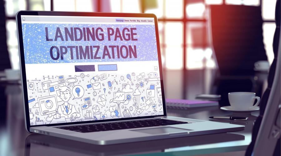
In digital marketing, a landing page is a standalone web page made specifically for a marketing campaign. It is the page a visitor arrives at on your website after clicking an ad. The best landing pages are persuasive and direct. While creating lead conversions and engagement, landing pages are designed to get a glimpse of your product or service information.
Tips to create successful Landing Pages that convert
Before anything else, you need to determine what your goals are. Once you have your goal, messages and keywords you can start creating a landing page together.
1) Landing pages should be short and clean. It should offer all the right information but not too overwhelming to drive the visitor away.
2) Provide High quality content for your landing pages. The first impression lasts. It’s the right design and rich useful content that will keep your consumers interested.
3) Remember all roads lead to Rome. It’s important that you limit exit points like hyperlinks in that way visitors won’t have to leave your page. The goal is to lead visitors to click a call to action button.
7 Landing Pages designs from popular brands
Are you ready to create your Landing Page? Let’s take a look at each of these 7 best examples of landing pages.
1) DoorDash’s Dasher sign up
DoorDash executes the standard page design for service providers. But don’t be misguided by thinking it’s merely an onboarding page. Rather, look at the content on the page. A visitor is greeted with a call to action and sign-up field, which guides them to register and get started dashing for DoorDash. Visitors seeking more information on the brand before signing up can keep scrolling to a section that explains what DoorDash is, followed by a section that explains why you should work for DoorDash.
2) Apple’s Mac Pro landing page
Apple leads the tech industry in superior marketing and aesthetic use of white space in their branding. The power is in the scroll and its interactive capabilities when used effectively. The landing page tells a story, unveiling each paragraph with a flick of a finger. Yet this particular landing page isn’t designed for a typical Apple consumer, and it differs slightly from their other web pages. The company is well aware of its target audience for this product: creative professionals, videographers, film and photo editors in need of a device suited for processing massive amounts of raw data.
It utilizes the tried and tested approach for its content collaboration’s landing page design. Dropbox uses minimal white space as its driving force to carry its design, carefully incorporating copy and imagery when necessary. We are greeted with an aesthetic motion graphic that visually communicates the platform’s claim of collaboration, as well as a CTA button prompting the visitor to try the platform for free.
4) Slack
Slack has risen as the go-to platform for workplace communication and collaboration, being the main platform for both new and old industries. Their landing page is brief, only containing the relevant information for the visitors. We’re given introductory and concluding calls to action for the visitor to download the Slack application.
5) Shopify
It is simple and very straightforward. Its goal is to make the visitors register their e-mail and start using the platform. Instead of paragraphs to describe the service, the company chose to insert three small but informative texts. The leads receive essential information such as price, features or the number of customers who already use the tool.
6) Airbnb
Airbnb’s goal is to turn guests into hosts to maintain the relevance and growth of the company. And what way to convince someone to use the service than to show how much a visitor could profit from it? That’s the idea behind their landing page, simple and straightforward.
7) DHL Express
Their landing page is a complete content that gives the visitor freedom to navigate between different types of details. Vibrant yellow and red colors represent the visual identity of the brand and draw attention to the page. Also, the lead can play a one-minute video from the company.
Conclusion
Now that you’ve seen 7 amazing examples of landing pages, you are now ready to boost your company’s result. Perfect landing pages, which have undergone extensive trial and error will give you the best conversion but poorly designed ones can turn off leads even before they read about your offer. Keep running tests on different elements to see what works best for your leads. Don’t forget to be creative and build engaging and eye- catching pages. After all, creating a high converting landing page isn’t rocket science!
References:
- “13 Great Landing Page Examples You’ll Want to Copy in 2021”.hubspot. Retrieved September 15, 2021, from: https://blog.hubspot.com/marketing/fantastic-landing-page-examples
- “32 best landing pages from popular brands”. Webflow. Retrieved September 15, 2021, from: https://webflow.com/blog/best-landing-pages
- “21 Great Landing Page Examples (+ How to Make Your Own!)”. WordStream. Retrieved September 15, 2021, from: https://www.wordstream.com/blog/ws/2014/02/12/great-landing-pages
- “8 best landing pages to convert in 2021”. Rockcontent. Retrieved September 15, 2021, from: 8 best landing pages to convert in 2021 (rockcontent.com)